Home
>
Baby & Kids' Room Decor – Tips & Inspiration
>
Trend Colours for a Child's Room in 2026: The Complete Guide to Soft, Contemporary Decor

Trend Colours for a Child's Room in 2026: The Complete Guide to Soft, Contemporary Decor
By Marlene Fancelli, published 29 June 2026, 8 min read
Powdery terracotta, sage green, baby blue, off-white... In 2026, children's rooms are dressed in soft tones inspired by nature. But how do you choose among all these options? Which palette should you go for in a room that will stand the test of time and still look beautiful once you're back from the shops?
This complete guide gives you all the keys to choosing the colours for your baby's or child's room in 2026: the leading trends, the palettes that work, the mistakes to avoid, and how to pair these colours with watercolour illustrations for a coherent, poetic result.
The Big Colour Trends for Children's Rooms in 2026
2026 confirms a trend that has been building for a few seasons now: a return to the essentials. Gone are rooms shouting with saturated colours or overloaded themes. Today's children's rooms are moving towards a soft, natural, timeless aesthetic that reassures babies and parents alike.
Three main colour families dominate this year:
1. Earthy, Organic Tones
Terracotta, caramel, soft ochre and sandy brown are the stars of baby and children's rooms in 2026. These tones evoke earth, warmth, distant savannahs. They create a cosy, enveloping atmosphere, particularly well suited to north-facing rooms or spaces with less natural light.
The secret to their success? These colours pair beautifully with natural wood (beech, oak, pine furniture), cotton and natural linen textiles, and of course savannah-theme watercolour illustrations: lion, elephant, giraffe, whose warm tones resonate beautifully with these palettes.
Terracotta Savannah Palette: Soft terracotta / Warm sand / Pale caramel / Sandy white / Earth brown
Tip: Feature wall: soft terracotta (1 wall) + sandy white (3 walls), Furniture: natural wood, Textiles: linen and off-white cotton
2. Natural, Botanical Greens
Green stands out as THE trend colour of 2026 for children's rooms. But not just any green: think sage green, eucalyptus green, lime green, moss green — desaturated tones, close to nature, that soothe and calm.
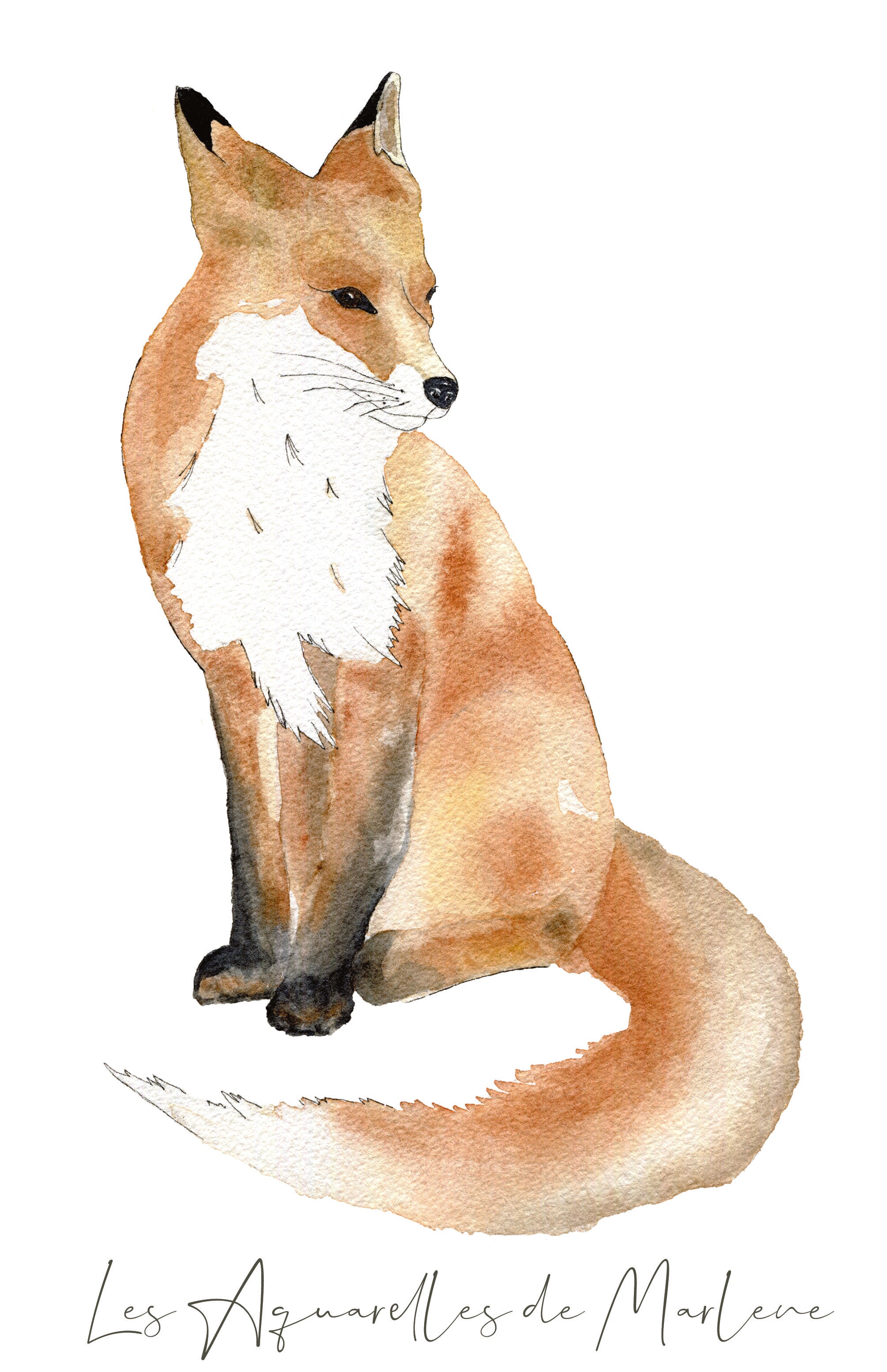
These shades pair beautifully with off-white, light wood and forest-theme watercolour prints (fox, rabbit, hedgehog, deer). The result is a soft, botanical cabin-like room, perfect for a storybook world.
Sage Forest Palette: Sage green, Pale mint green, Lime green, Botanical white, Forest green
Tip: Feature wall: sage green, Ceiling: botanical white, Textiles: white cotton, natural pompoms
3. Soft Blues and Aquas
Blue is no longer confined to boys' rooms. In 2026, pastel baby blue, sky blue, powdery turquoise and ocean blue-green are finding their way into every baby room, girls' and boys' alike. These tones evoke the sky, the sea, freedom, and create a bright, serene atmosphere.
Paired with white and touches of sand or beige, these blues form poetic marine palettes, perfect for welcoming watercolour sea animal prints — whales, seahorses, dolphins, starfish.
Pastel Ocean Palette: Soft sky blue, Baby blue, Pale aqua, White sand, Turquoise blue
Tip: Accent wall: sky blue, Secondary walls: off-white, Floor: light carpet or wood flooring
The 5 Most In-Demand Trend Palettes of 2026
Beyond the main colour families, here are the five colour combinations most sought after this year for baby and children's rooms:
Palette 1: Beige + Off-White + Terracotta
The safest and most effective palette of 2026. Timeless, soft, easy to work with in decor. It suits any room orientation, works with any furniture, and will easily see a child through the ages of 0 to 10. Ideal for a gender-neutral room.
💡 Marlene's tip: This palette is especially flattered by savannah-theme watercolour illustrations. The warm tones of the lion, the elephant and the koala resonate naturally with beige and terracotta.
Palette 2: White + Sage Green + Natural Wood
The winning trio of "nature" decor in 2026. Simple, clean, never dated. White structures the space, sage green brings life and softness, natural wood warms up the whole. Perfect for a Scandinavian or wabi-sabi style.
Palette 3: Baby Blue + Sand + White
The marine palette par excellence: soft, bright, universal. It suits a girl's room just as well as a boy's, and evokes a soothing seaside feel. Pair it with watercolour sea animal prints for a poetic result.
Palette 4: Powder Pink + Dusty Rose + Linen
Pink is back in 2026, but in far more sophisticated versions than before. No more fuchsia or bubblegum pink: enter powder pink, blush pink, dusty rose and soft mauve. These tones create an elegant, soothing room, far from the "girl's room" clichés.
Palette 5: Ochre + Soft Black + Natural
For parents who want a more graphic, confident room, pairing golden ochre with a softened black (anthracite grey or ink black) creates a chic, contemporary contrast. Use sparingly: one black accent wall at most, so as not to weigh down the space.

Gender-Neutral Baby Room: Which Colours Avoid Pink or Blue?
This is one of the most common questions from expectant parents: how do you decorate a baby room without knowing the sex, or when deliberately choosing not to play the pink/blue card?
The 2026 answer is clear: neutral, natural colours offer the most freedom and the longest lifespan. Here are the tones that work universally:
• Off-white / cream: the perfect base, works with everything
• Linen beige / sand: warm, natural, gender-neutral by nature
• Sage green: the 2026 trend, neither feminine nor masculine
• Powdery terracotta: warm, grounded in nature
• Light grey / pearl grey: understated and elegant, but needs warming up with textiles
💡 The great advantage of watercolour illustrations? Their naturally soft palette (transparencies, washes, organic tones) makes them perfectly gender-neutral. A woodland fox, an elephant or a seahorse look wonderful in any room, for any baby.
To go further, check out our dedicated article: 15 gender-neutral baby room ideas without pink or blue.
How to Choose Your Wall Colour Based on the Room's Orientation
The tone you choose won't behave the same way depending on the room's light exposure. Here are the essential rules:
South- or West-Facing Room (Bright)
Lucky you! Intense natural light lets you be bold with deeper tones without risking a heavy feel. A rich sage green, a bolder terracotta or even a midnight blue on an accent wall will look stunning.
To avoid: whites that are too cool (bluish), which can feel sterile in a very bright room. Go for off-whites, cream or ivory instead.
North- or East-Facing Room (Less Bright)
Go for light, warm tones to make up for the lack of light: sandy white, light beige, very pale lime green. Avoid grey and cool blue, which would heighten the feeling of coldness.
The trick: a well-placed mirror and watercolour illustrations in golden or warm tones wonderfully compensate for a lack of natural light.
The 60-30-10 Rule
For a harmonious palette, apply this simple rule:
• 60% of the room in the dominant colour (walls, floor)
• 30% in a secondary colour (furniture, curtains)
• 10% in an accent colour (cushions, prints, small objects)
2026 Trend: "Color Drenching", or How to Dare a Monochrome Room
Color drenching is the most talked-about decor trend of 2026: it involves painting walls, ceiling and woodwork in the same tone — and sometimes even the furniture — to create a fully enveloping atmosphere.
The tones best suited to color drenching in a baby's room:
• Off-white / cream (the ideal starting point)
• Pale sage green (enveloping and soothing)
• Very light sky blue (dreamy, poetic)
• Sandy beige (warm and timeless)
💡 With color drenching, prints and illustrations become even more important: they bring the contrast and vibrancy that a monochrome palette can't provide on its own. It's the perfect moment for a well-composed watercolour print triptych that catches the eye the moment you walk into the room.
Pairing Colours and Watercolour Illustrations: Our Advice
The great strength of watercolour illustrations is their ability to adapt to almost any palette. The translucent washes, soft outlines and naturally desaturated tones of watercolour make it a particularly chameleon-like medium.
Method 1: Choose Your Wall Colour First, Then the Prints
Gone for a terracotta wall? Choose savannah watercolour prints whose orange, ochre and sandy tones speak to your wall. The effect is immediate and cohesive.
Method 2: Choose the Prints First, Then the Wall Colour
Fallen in love with a particular illustration? Look at its dominant colours and choose a wall tone that flatters them. A blue-grey whale print on a baby-blue wall: perfect. An orange fox on a sandy beige wall: stunning.
What to Remember
Whichever method you use, make sure your watercolour print shares at least one colour with your wall palette. It's the best way to achieve a visually coherent result without being too matchy-matchy.
Looking for the perfect watercolour illustration for your palette?
Discover all the watercolour animal prints, hand-painted in Provence on 250gsm paper — See all the watercolour prints →

Trend Colours by Room Theme
🦁 Savannah Baby Room
Perfect palette: terracotta + sand + off-white + golden ochre. Pair these tones with savannah watercolour prints (lion, elephant, koala, giraffe) and a wooden savannah height chart to complete the look.
🌿 Forest Baby Room
Perfect palette: sage green + natural white + light wood + touches of burgundy. A watercolour forest room with a fox, a rabbit and a hedgehog on the walls creates a soft, poetic storybook atmosphere, ideal from birth.
🐳 Ocean Baby Room
Perfect palette: baby blue + sand + white + touches of turquoise.
🌸 Contemporary Gender-Neutral Baby Room
Perfect palette: off-white + sage green + natural wood + touches of terracotta. The quintessence of the 2026 trend: neutral, natural, timeless. Dress it with watercolour animal illustrations whose palette plays on warm, soft tones.
Mistakes to Avoid When Choosing Colours for a Child's Room
• Painting walls too dark in a small room — one accent wall, yes; four dark walls, no.
• Choosing colours that are too bright — they can disturb baby's sleep and "date" very quickly.
• Not testing the colour with a sample pot before painting — the same shade can look completely different depending on your room's light.
• Forgetting the floor and furniture — wall colour should harmonise with the flooring, carpet and furniture already in place.
• Mixing too many colours — sticking to three colours max (excluding white and wood) generally gives the most harmonious results.
• Choosing an unsuitable paint — for a baby's room, always opt for a washable, VOC-free paint with an A+ air quality label.
Related Articles
To take your decor project further:
- 15 gender-neutral baby room ideas without pink or blue
- Baby Room Decor 2026: 10 Ideas for a Soft, Poetic Cocoon
- Watercolour Animal Print for Baby's Room: How to Choose the Perfect Decor?
Frequently Asked Questions — Children's Room Colours 2026
What's the trend colour for a baby's room in 2026?
In 2026, the trends favour natural, soft tones: powdery terracotta, sage green, linen beige, pastel baby blue and off-white. These tones draw on nature and create a soothing atmosphere for baby.
What colour should I choose for a gender-neutral baby room in 2026?
For a gender-neutral baby room, neutral palettes work very well: beige, off-white, linen, soft green, or pastel terracotta. These colours are neither too feminine nor too masculine, and pair perfectly with watercolour animal illustrations.
What colours should be avoided in a baby's room?
It's best to avoid overly bright or saturated colours (bold red, fluorescent yellow, bright orange), which can overstimulate babies and disturb their sleep. Go for soft, desaturated tones, especially on the walls.
How do you match a child's room colours with watercolour prints?
Watercolour illustrations have the advantage of pairing with almost any palette thanks to their naturally soft, translucent tones. For a harmonious result, choose prints whose dominant tone echoes one of the colours in your walls or furniture.
Is green a good colour for a baby's room?
Yes! Sage green, mint green and lime green are among the most trend-forward tones for baby rooms in 2026. Soft and evocative of nature, these shades create a serene, soothing mood, ideal for sleep.
Can you paint the whole baby room a single colour?
Absolutely. The color drenching trend (total monochrome) is very present in 2026: walls, woodwork and ceiling are painted in the same tone for an enveloping, soothing effect. Ideal with an off-white, a warm beige or a pale green.
In Summary
The trend colours for children's rooms in 2026 are those that speak of nature: terracotta, sage green, baby blue, linen beige. Soft, desaturated, timeless tones that will create a beautiful room for your baby today, and a beautiful setting for your child tomorrow.
And if you're looking for the illustration that will perfectly complete your palette, know that every watercolour hand-painted in my Aix-en-Provence studio is designed to blend naturally into these decor worlds. Because a beautiful room is, above all, a room that tells a story.
Create the room of your dreams: Discover the shop →
Share