Home
>
Baby & Kids' Room Decor – Tips & Inspiration
>
How to Choose the Right Placement for Prints in a Child's Room

How to Choose the Right Placement for Prints in a Child's Room
In a baby's or child's room, a beautiful print isn't chosen for its illustration alone. Where it's placed matters just as much. Positioned well, it catches the eye, structures the space, softens the mood and showcases the whole feel of the room. On the other hand, a print hung too high, poorly paired with the furniture, or placed in a too-busy area, can lose its charm.
Watercolour prints have this particular strength: they bring poetry without weighing down the decor. But you still need to know where to hang them so they find their place naturally. In this guide, here's how to choose the right placement for prints in a child's room, with concrete tips inspired by Les Aquarelles de Marlene's creations.
Look at the Room Before Choosing a Wall
Even before hanging a print, the most important thing is to look at the room as a whole. Every room has its strong visual zones: above the bed, near the chest of drawers, in the reading corner, above a low piece of furniture, or on a bare wall that feels a little lifeless. The right placement therefore depends first on flow, natural light and the furniture already in place.
In a child's room, you're generally aiming for soft, balanced, reassuring decor. A print should complete the space, not overload it. It's better to let the walls breathe than to pile too many elements into the same spot.
The most beautiful placement is often the one that creates simple, natural visual harmony the moment you walk into the room.
Ask Yourself the Right Questions
To choose the ideal placement, it can help to think through a few very concrete points:
- Which wall catches the eye first when you walk into the room?
- Where does the light show off the illustration best?
- Is there a piece of furniture that could anchor the print visually beneath it?
- Is the area calm and uncluttered?
- Are you after a decorative, educational, or more emotional effect?
These questions help you choose a placement that suits each print's purpose.
Above the Bed or Cot: A Soft, Structuring Choice

The wall above the bed is often one of the first placements considered in a baby's or child's room. It's a central, visible spot that's easy to showcase. A well-chosen print here helps structure the decor and create an enveloping atmosphere.
For this spot, tender, poetic illustrations work particularly well. The watercolour koala family print suits this placement beautifully. Its gentle scene of a mother koala with her baby immediately brings a feeling of tenderness and comfort. According to its product page, it was designed for a baby's or child's room and lends itself very well to soothing decor, notably as a birth gift.
Above a bed, it's best to keep the composition clean. A single large print, or a light arrangement, is often all it takes to create a beautiful effect.
The Right Height to Keep the Balance
A print shouldn't be hung too high. If it floats too far above the furniture, it looks disconnected from the rest of the room. The idea is for it to visually converse with the bed, the cot or the headboard, rather than seeming lost on the wall.
In a child's room, wall decor works best when it stays within easy view and at the room's own scale.
Near the Reading or Play Corner: Decor That Supports Discovery
The reading corner, the teepee, the small bookshelf or the play area are perfect spots for prints that spark curiosity. In these lived-in zones, a print isn't just decorative: it also accompanies quiet moments, conversation and learning.
The watercolour animal alphabet print fits particularly well in this space. Its product page highlights its dual decorative and educational purpose, with an alphabet illustrated through watercolour animals. It's a soft print, but also a useful one for introducing the child to letters in a reassuring setting.
Placed near a low bookshelf or an armchair, it helps build an atmosphere conducive to early learning. It can become a daily talking point: naming the animals, recognising the letters, noticing the colours.
Favour a Calm Wall
For an educational print, it's best to avoid walls already crowded with shelves, garlands or visually busy toys. A fairly simple background will keep the illustration easy to read and pleasant to look at.
Practical note: in a reading corner, an educational print works best in a peaceful space that encourages observation and focus.
Above a Chest of Drawers or Low Furniture: The Easiest Placement to Get Right

If there's one placement that's almost always effective in a child's room, it's the wall above a chest of drawers, a small storage unit or a changing table. The furniture creates a visual base that helps the print find its place naturally.
This spot suits a single print just as well as a coordinated duo or trio. For a soft, natural mood, animal illustrations are particularly well suited.
Creating a Forest or Nature Mood
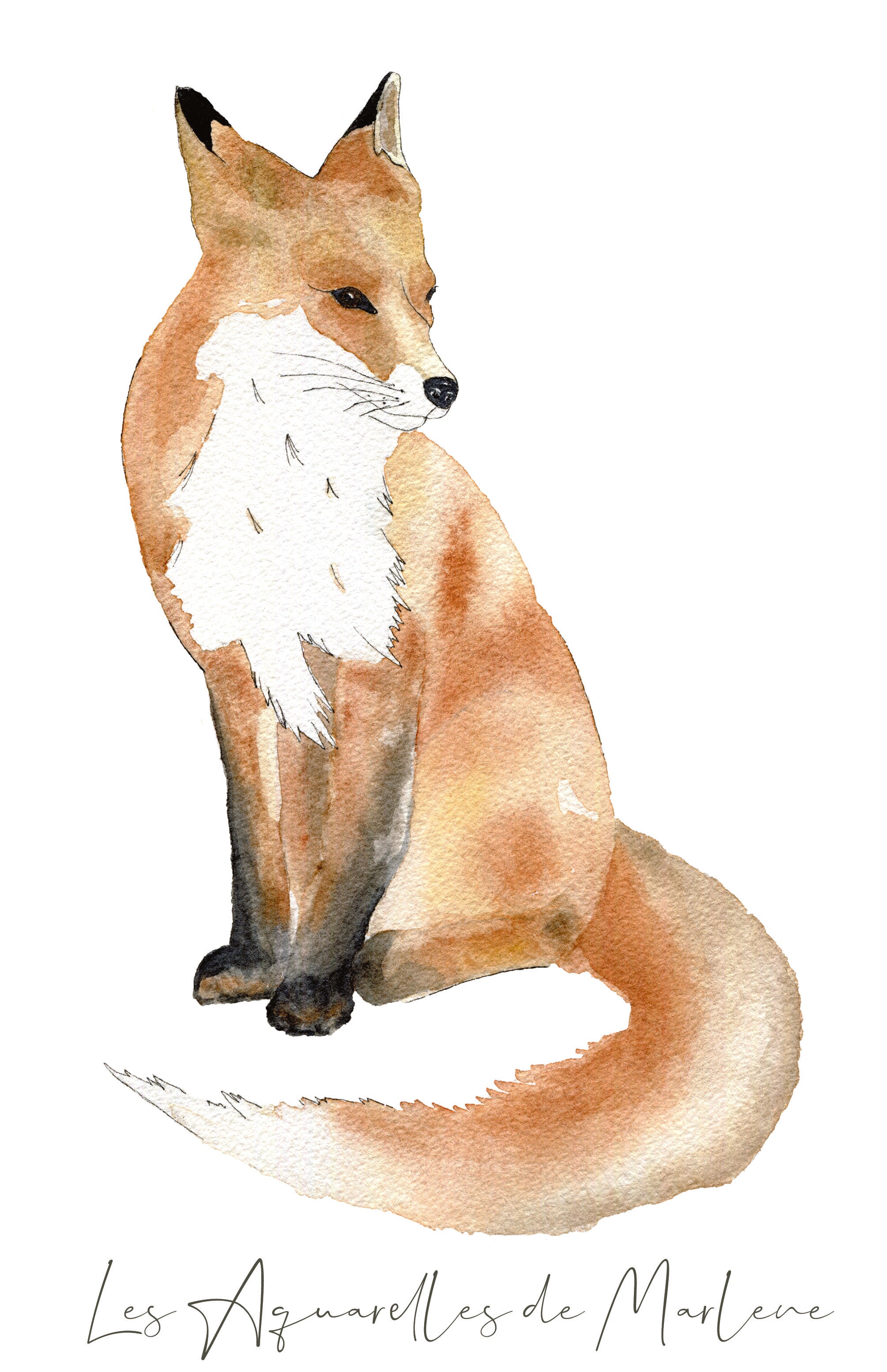
If you love warm tones and nature-inspired worlds, the Gaspard fox watercolour print and the Auré hedgehog watercolour print form a lovely duo. According to their product pages, both prints are designed for soft, poetic wall decor in a baby's or child's room, with original watercolour illustrations, available in A4 and A3. The hedgehog print can also be personalised with a name according to its product page, adding to its appeal as a gift or birth keepsake.
On a wall above a chest of drawers, these prints can be placed side by side to create a harmonious composition. They pair particularly well with light wood furniture, natural-fibre baskets and a soft colour palette.
- The fox brings a tender, lively touch to a forest theme
- The hedgehog reinforces the cosy, natural feel
- The duo works well in a gender-neutral or evolving room
Decor tip: if you're pairing several prints, keep the spacing even for a calm, polished result.
On a Wall Visible From the Doorway: Showcasing a Statement Print
Some walls have an immediate impact the moment you open the door. These are great spots for a print that sets the tone for the whole decor. If the room follows a specific theme, this spot lets you affirm it with subtlety.
In a sea-theme room, the Sam sea turtle watercolour print is a beautiful choice. Its product page highlights its ocean-inspired world, its hand-painted illustration, and its soft, soothing style for a baby's or child's room. It comes in A4 and A3, on textured paper, with a raw wood frame, according to the available information.
Placed on a wall visible from the doorway, it becomes a statement piece without being overwhelming. It's particularly well suited to rooms in greyish blue, sand, off-white or aqua-green tones.
Let the Composition Breathe
When a print already has a strong presence through its theme or placement, there's no need to crowd the space around it. A well-cleared wall shows off the illustration far better than a dense arrangement.
Careful: a cluttered entrance wall can create a sense of visual disorder. A single beautiful, well-placed print beats several elements competing for attention.
Match the Placement to the Print's Purpose
Not every print plays exactly the same role in a child's room. Some are there to reassure, others to bring a decorative theme to life, and others still to spark curiosity. Their placement can therefore vary depending on the effect you're after.
For an Educational Print
Favour a lived-in space where the child can see it regularly: reading corner, child's desk, a wall near a low piece of furniture. The goal is for it to be part of everyday life.
For a Tender, Emotional Print
Visuals like the koala family work very well near the bed or the rest area. They contribute to a tender, almost enveloping atmosphere.
For a Nature or Animal Theme Print
The fox, hedgehog or sea turtle prints can structure a specific mood on a main wall, above a chest of drawers, or in a simple wall arrangement.
Choosing Between a Single Print and a Composition
In some rooms, a single print is enough to create a real decorative presence. This is often the case if the wall is narrow, the room is small, or the illustration already has a strong personality.
In other cases, you can put together a small, coherent set. The forest duo with the fox and the hedgehog, for example, can work very well on a wider wall. The key is to keep visual unity in the tones, themes and spacing.
- A single print for a clean look
- A duo to structure a wide piece of furniture
- A single educational print in a reading corner
- A statement print on the wall visible from the doorway
Recommendation: before drilling, lay the frames on the floor or test with paper templates on the wall. This helps you visualise the overall balance.
Frequently Asked Questions About Placing Prints in a Child's Room
Where should I put a print in a baby's room?
The easiest placements to get right are above the chest of drawers, near the bed, or on a wall visible from the doorway. The best choice depends on the style you're after and the furniture already in place.
Which print should I place near a reading corner?
An educational print like the watercolour animal alphabet is particularly well suited, as it supports quiet moments and discovery.
Can you combine several animal prints?
Yes, as long as you keep a consistent theme and tone. The fox and the hedgehog pair beautifully in a soft, natural forest mood.
Where should I put an ocean-theme print?
A print like the sea turtle can be showcased on a main wall or a wall visible from the doorway, especially in a sea-theme room.
Creating a Soft, Coherent, Lively Room

Choosing the right placement for prints in a child's room means finding the right balance between decor, emotion and purpose. A carefully placed illustration can turn a bare wall into a poetic world, structure a reading corner, soften the rest area, or give the whole room its character.
With their original watercolour illustrations, hand-painted then printed in Provence, Les Aquarelles de Marlene prints find their natural place in this world. Whether it's the animal alphabet print, the koala family print, the Sam sea turtle print, the Gaspard fox print or the Auré hedgehog print, the right placement is the one that respects the softness of the room while showcasing the illustration's personality.
To go further, take a look at our article on how to choose the perfect decor?
The Studio's Advice
In a child's room, the most beautiful decor is often the kind that feels obvious. A well-placed print doesn't just fill a wall: it accompanies the early years, brings poetry to everyday life, and helps create a cocoon where the child grows up gently.
Share